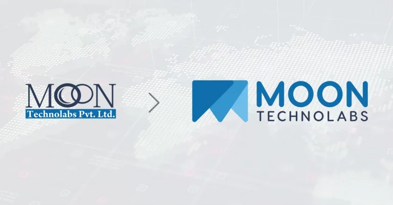
Our adrenaline has already kicked in, which has made us a little more excited in bringing our ‘New Logo’ to life. We are eager as well as proud to announce the launch of a new company logo as a part of our acknowledging as well as celebrating the ongoing growth and success of our company’s brand.
Since our initial stage, we have stayed with the same definitive impression of ‘Moon’ in our company logo. However, our business has evolved over the years and the change was long overdue. We were in a need of image makeover that would actually not only rhyme with the modern aptitude & take of our worldwide clients but also being assertive and coherent with our vision. With our new logo, our aim is to showcase the ability to deliver excellent quality, performance and service support across the design & development aspects of the software industry. Without further ado, let’s take a look at the new changes in the logo.
As you can see from the image, the new logo is adapted with new colors & font but more importantly, the shift of focus from ‘Moon’ impression to a collaborative, just the letter ‘M’. This approach of rebranding was induced to bring all the elements in more alignment with the intuitive take on amalgamating the design, development and service parts. Hence, the three variant section of the letter’s’ in the logo.
Drawing inspiration from the mathematical figure – ’triangle’, that is most relevantly resembling the letter ‘M’.

Matching the three acute angles with the corners according to the design paved the way to draw attention to the design, development & service part.

Representing the 3 triangles individually explains our take on giving equal importance to each and every part of the project responsibility we undertake.

Merging them all shows the capability and strength of our designers and developers to deliver the task on-time and adhere to compliance. However, black was not eye-catchy.

We used the color ‘Blue’. As the blue color is vibrant on its own and also implies the vast and vividness of Moon Technolabs in its entirety considering the ‘Moon’ & ‘Sky’.


The strategic approach behind the color ‘Blue’ was to encapsulate the aesthetics of ‘Moon’ & ‘Sky’ to depict that our simplistic approach allows us to stay vibrant and produce unique solutions to our clients while concentrating all the possibilities available to cater to the task at hand.
We are definitely sure that the new changes will be welcomed by our existing clients and customers. We are utmost certain by now that the employees are already loving it and enjoying the new image of the company’s brand identity.
We are also going to roll this out soon everywhere we are out in public and on social media platforms such as Facebook, etc. Meanwhile, we urge everyone, not only our clients & customers but also readers to keep an eye on our upcoming events and news posts to stay updated regarding the much-awaited changes that are going to follow. Also, there are few future updates which are not only going to be beneficial for clients and employees but also to the company as a corporate. Moon Technolabs in its entirety is going global may it be the looks, feel or service aspect.
Well, it did take a lot of time but the hard work and perseverance from each and everyone has seemed to paid off. ‘Patience is a key virtue’ in attaining highest goals and we take this moment to thank all of you for keeping patients and playing your part in making ‘Moon Technolabs’ a global success and top most mobile app development company. With this perspective, we aim to present ourselves better and attend to your business needs by providing end-to-end services in times to come.
Submitting the form below will ensure a prompt response from us.


