Table of Content
Blog Summary:
Tailwind CSS and Bootstrap have emerged as the two top design languages, bringing their distinct layout styles and code libraries to build responsive and user-friendly web applications. This in-depth guide on Tailwind vs. Bootstrap is for small startups and large businesses looking to make informed decisions about their web development projects. It covers all the benefits, features, and ideal cases when they should choose a CSS framework.
Table of Content
A website without properly assembled and designed elements would be difficult to navigate and feel chaotic. While the headings, paragraphs, and buttons lay the foundation of a webpage, it’s essential to organize the layouts, add vibrant colors, and arrange spaces.
What if we told you that your business can choose how to organize your webpage elements to make them functional and visually appealing? This blog focuses on the Tailwind vs Bootstrap conquest—the two leading CSS (Cascading Style Sheets) frameworks for styling web pages.
Bootstrap offers a catalog of pre-built designs, allowing you to furnish your webpage with ready-made components. Tailwind, on the other hand, offers a set of tools and materials to craft a design tailored to your exact vision.
Let us explore the strengths of both frameworks and help you decide which approach best suits your web development goals.
What is Bootstrap?
Bootstrap has been in charge of frameworks since it was introduced in 2011 as an open-source framework. Originally known as Twitter Blueprint, it was renamed Twitter Bootstrap by the two engineers Mark Otto and Jacob Thornton. They developed it to make Twitter’s internal tools more consistent.
In this fight between Tailwind and Bootstrap, the latter uses a component-based approach to allow developers to build consistent and visually appealing interfaces. Its main purpose was to address the inconsistencies and high maintenance costs that resulted from using various libraries to develop Twitter’s interface.
With Bootstrap, developers have access to its responsive 12-column flexible grid system. This system guarantees the development of web applications with adaptable layouts for any screen and device.
Its strength lies in its responsive framework, customizable themes, plenty of JavaScript plugins, and pre-built interface elements. Here’s an example of how a hamburger navigation menu will be built using Bootstrap with steps:
- Create a navigation bar using the class navbar.
- Create a responsive menu using navbar-expand-lg to create the hamburger menu and navbar-dark bg-dark to style the bar with an ark background.
- Control toggling using data-bs-toggle=collapse and data-bs-target=”#navbarNav.”
- Make a collapsible menu using collapse and navbar-collapse classes.
Here’s how it would look:
<!– Navigation Bar –><nav class=”navbar navbar-expand-lg navbar-dark bg-dark”><div class=”container”>
<!– Hamburger Menu Button –>
<button
class=”navbar-toggler”
type=”button”
data-bs-toggle=”collapse”
data-bs-target=”#navbarNav”
aria-controls=”navbarNav”
aria-expanded=”false”
aria-label=”Toggle navigation”>
<span class=”navbar-toggler-icon”></span>
</button>
</div>
</nav>
While Bootstrap is available for download via JavaScript, pre-built CSS, and a source code, you can also deliver it through a Content Delivery Network (CDN) and package managers like NPM and Yarn.
Benefits of Using Bootstrap

In the high-voltage battle of Bootstrap vs. Tailwind CSS, the former has become exceptionally popular due to its consistency across pages and platforms. The uniformity of designs, coupled with the pre-built components, immensely helps speed up the development processes.
Let’s understand its benefits through an example:
You are an e-commerce startup looking to build a responsive website quickly but have a small team that needs a dedicated UI/UX designer. Here’s how Bootstrap will help:
Ease of Implementation
With Bootstrap, you can easily implement a seamless experience by automatically adjusting the layouts across any device screen.
Tip: Use the class container and row to ensure proper alignment across all screen sizes.
Extensive Pre-built Components
You can implement predefined classes and readymade UI elements like navigation bars, modals, buttons, and forms, speeding up the website’s development process in hours rather than days.
Tip: Build product grids with the responsive grid system using class col- and avoid using complex CSS.
Cross-browser Compatibility
The component library is highly customizable with in-built compatible options, allowing you to build websites according to your specifications. You can easily discard the unnecessary code by ticking off things that aren’t needed.
Tip: Use loaded Bootstrap for JavaScript components to ease opening modal windows and trigger alerts.
Strong Community and Documentation
Bootstrap provides comprehensive, beginner-friendly documentation that is equally useful for experienced developers. Additionally, its large developer community offers many free templates, plugins, and solutions.
Tip: Utilize repositories like GitHub and Stack Overflow for free templates and plugins.
Responsive Utilities and Grid System
Responsiveness is a major necessity in web applications, and Bootstrap makes it easy with its 12-column fluid grid layout. You can choose to hide or show grid sections according to the OS.
Tip: Use responsive classes like d-none and d-lg-block for tailored content visibility.
Comprehensive Theme Support
Bootstrap has built-in support for adaptable styles, colors, spacing, and typography, with SCSS variables, mixins, and a configuration file that can be changed without rewriting the code.
Tip: Modify the primary color using $primary in the SCSS configuration file to match brand colors.
When to Use Bootstrap?
Whether you have a small startup project or a large one, using Bootstrap will enable you to build innovative functionality without spending excessive time on design intricacies. It’s an ideal choice when you’re working with old systems or just starting with CSS.
Here are some scenarios where it would be best to choose Bootstrap:
Quick MVPs of a Web Application
You need to develop a quick working prototype MVP of the web application, which is the most basic version with only the necessary features.
Why Choose Bootstrap: Bootstrap’s UI library contains many built-in components, such as buttons and navigation elements, allowing you to quickly assemble them without writing custom CSS.
How to Use: Use built-in classes for buttons like btn-primary for the login page.
Responsive Layouts Across Devices and Screens
You are looking to build a web application that can reliably perform across different Internet browsers and mobile devices.
Why Choose Bootstrap: It has a responsive grid system and utilities while reducing debugging time on browser and device issues.
How to Use: Build adjustable dashboard layouts using the grid to divide sections into a sidebar for each screen with classes like col- and row, along with utility classes like d-md-none.
Heavy Back-end Projects with Front-end APIs
You have a web application with a heavy backend that needs a simple front end to display data fetched from integrated APIs.
Why Choose Bootstrap: Its table classes, along with spinners, enhance the structured data display, and utility classes help style the content generated in the back end.
How to Use: Use Bootstrap cards, navbars, and list groups to fetch data from APIs and menus to display server stats and embed forms to create and manage posts.
Build Web App Prototypes Faster with Bootstrap
Choose Bootstrap for pre-styled, professional designs and faster development.
What is Tailwind CSS?
Adam Wathan and Steve Schoger founded Tailwind CSS in 2017. Popularly known for its high adaptability and utility-based approach, Tailwind is more customizable than Bootstrap.
Unlike its counterpart, Tailwind doesn’t have pre-built classes. Instead, it is packed with a large collection of small utility classes that allow developers to build custom styles.
Before we discuss how classes work in Tailwind CSS, we need to understand what utility classes mean in CSS. CSS Utilities are simple commands with which you can instruct a web application to behave in a specific way using shortcuts like:
- Make this text small.
- Color this background red.
- Put this text on the left.
So, in normal CSS utilities, if you want to put text in the center, you can use .text-center. Similarly, if you want to make a text big, you can use .fs-1.
Tailwind CSS enables developers to use these little helpers instead of writing long, complicated rules. It offers developers the benefit of directly manipulating HTML code. It uses utility classes with more granular control. Here’s how:
To make the text extra large, use text-4xl. Similarly, to make text bold, use font-bold.
Taking the same example of a hamburger menu coded with Bootstrap earlier, let’s see how it would be different in Tailwind. Here are the steps:
- Create background color and padding using bg-gray-800 p-4.
- Create the menu icon using custom <svg> and size it with classes w-6 h-6.
- Create responsive behavior using hidden md: flex.
Here’s how the code will look:
<!– Navigation Bar –>
<nav class=”bg-gray-800 p-4″><div class=”container mx-auto flex items-center justify-between”>
<!– Hamburger Menu Button –>
<button
class=”text-gray-200 md: hidden”
type=”button”
aria-expanded=”false”
aria-label=”Toggle navigation”
@click=”open = !open”>
<svg
class=”w-6 h-6″
xmlns=”http://www.w3.org/2000/svg”
fill=”none”
viewBox=”0 0 24 24″
stroke=”currentColor”>
<path
stroke-linecap=”round”
stroke-linejoin=”round”
stroke-width=”2″
d=”M4 6h16M4 12h16M4 18h16″ />
</svg>
</button>
</div>
</nav>
Tailwind CSS allows you to use classes directly on the elements. It also serves as a highly useful Integrated Development Environment (IDE) with VS Code and autocomplete features.
Benefits of Using Tailwind

Tailwind comes loaded with many essential CSS classes that can be used to create designs quickly. It also monitors the code you write and removes unnecessary code. Its utility-first approach in working with UI components has benefitted many other CSS frameworks like Daisy UI and Flowbite. Let’s understand these in more detail:
High Performing and Customizable
Tailwind CSS reduces the size of the CSS file by reusing styles. Its configuration file allows developers to define custom colors, spacing, and fonts, reducing loading time and increasing performance.
Tip: Use the extend property in the configuration file to add custom styles. To minimize setup time, start with default utilities and customize them later.
Faster Prototyping
Tailwind’s utility patterns save you time and effort. Developers can address issues like class specification, organization, and cascading and build prototypes faster by using Tailwind’s utility patterns.
Tip: Use Tailwind’s online editor, play.tailwindcss.com, which helps build and test prototype ideas before implementing them.
Lightweight Output
One of the biggest differences between Bootstrap and Tailwind is that the latter allows developers to style HTML elements directly rather than defining them in a separate CSS file. It removes the unused CSS with tools like PurgeCSS to deliver a lightweight, consistent, and efficient output.
Tip: Setup PurgeCSS during development for faster loading times and define reusable components to maintain consistency.
Scalable and Responsive Design
The Tailwind framework is highly adaptable since it prioritizes utility classes and provides ARIA-friendly components and semantic HTML. The combination helps developers build responsive and accessible web applications without leaving HTML files.
Tip: Utilize hover and focus classes for better accessibility of interactive elements, along with prefixes for intuitive layouts.
When to Use Tailwind?
Tailwind works its magic for organizations looking to speed up their web development processes with a strong and consistent brand identity. You can build mobile-responsive web applications across different devices while having full control over every part of their look and feel.
Let’s look at some ideal scenarios where it’s best to choose Tailwind:
Fully Customized UIs
Your startup wants to build a web app with a unique look to match your brand voice using customizable typography, colors, and layouts instead of pre-defined elements.
Why Choose Tailwind: You can craft custom designs directly into HTML without overriding default configuration to define a highly brand-specific and tailored UI.
How to Use: Build buttons and models from scratch for pixel-perfect designs.
Responsive and High-performing Front-ends
You want to build an e-commerce website that’s mobile-responsive to attract more users and looking to optimize its load time.
Why Choose Tailwind: You can create responsive layouts directly in HTML using only mobile-first utility classes to reduce CSS bloat and make the final CSS file small.
How to Use: Build lean, lightweight, and faster front-ends using fluid grids and buttons to simplify screen-specific adjustments.
Single Page Applications (SPAs)
You want to build a SPA using a framework like Angular, React, or Vue and work with an experienced team of developers who have full control over styling.
Why Choose Tailwind: It is highly flexible when creating custom components and works seamlessly with these frameworks. Due to its component-based architecture, it also integrates well with backend APIs.
How to Use: Build SPAs on JavaScript frameworks using Tailwind to style framework-specific components and smooth connections between APIs and backends.
Build Customized Web Designs with Tailwind
Optimize performance and design flexibility with Tailwind CSS that matches your brand.
Understanding the Key Features of Tailwind CSS and Bootstrap
Bootstrap and Tailwind share a common mobile-first approach to styling HTML elements. They also work flawlessly across browsers and seamlessly integrate with many modern web frameworks. However, they also have many differences in customization levels.
Let’s understand the differences between Bootstrap and Tailwind in brief:
| Particulars | Bootstrap | Tailwind CSS |
|---|---|---|
| Design Approach |
|
|
| Installation and Setup |
|
|
| Learning Curve |
|
|
| Performance and Speed |
|
|
| File Size |
|
|
| Customization Themes |
|
|
| Responsive Designs |
|
|
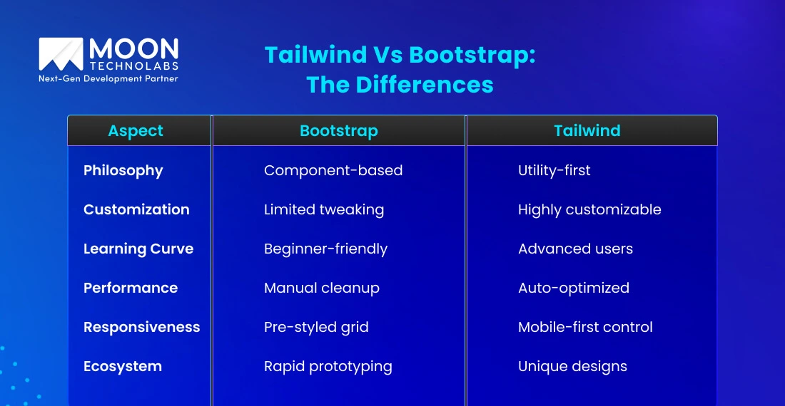
Tailwind Vs Bootstrap: The Differences

Bootstrap development services have been around the corner for quite some time and gave web development a headstart when needed. However, Tailwind, even being quite new in the scene, has become quite a favorite among web developers. Let’s understand how they are perfect contenders:
Philosophy and Design Approach
Bootstrap: It follows a component-based approach, offering pre-styled elements like navbars, buttons, and models.
Tailwind: It utilizes a utility-first approach, offering low-level utility classes like ‘text-center’ and ‘bg-blue-500’ for creating custom designs directly in HTML.
Who Won?: Bootstrap wins for standard, quick setups. Tailwind excels in highly customized designs.
Customization and Flexibility
Bootstrap: Customization is limited to tweaking pre-built components or using custom CSS/SASS overrides.
Tailwind: Full customization through ‘tailwind.config.js’ to define bespoke color schemes, spacing, and more.
Who Won?: Tailwind scores one over Bootstrap for flexibility and adaptability in unique brand needs.
Learning Curve and Suitability
Bootstrap: It’s beginner-friendly, has pre-built components, and doesn’t require in-depth CSS knowledge.
Tailwind: It demands a stronger understanding of CSS concepts and can be challenging for beginners.
Who Won?: Bootstrap is better for beginners. Tailwind suits experienced developers seeking creative freedom.
Speed and Performance
Bootstrap: It has unused CSS in files, which requires manual optimization to achieve better performance.
Tailwind: Unused CSS classes can be automatically purged with built-in tools, providing lighter CSS files.
Who Won?: Tailwind development services win for performance optimization.
Responsiveness and Accessibility
Bootstrap: It offers a robust and responsive grid system with readymade accessible components.
Tailwind: It offers mobile-first responsive utilities like ‘sm:’ and ‘md:’, providing more precise control over responsiveness.
Who Won?: Bootstrap is simpler to implement. Tailwind is better for detailed control.
Ecosystem and Use Cases
Bootstrap: Perfectly suited for rapid prototyping or enterprise projects that need pre-styled layouts.
Tailwind: It is ideal for projects demanding unique, brand-specific designs with scalability.
Who Won?: Bootstrap shines in speed-to-market. Tailwind is perfect for creating distinctive, custom UIs.
Tailwind and Bootstrap: When to Choose?
Tailwind CSS is ideal if:
- You are looking for flexibility, branding, and customization in your web development projects.
- You want to craft unique designs directly in your HTML.
- You are working with experienced developers in building and fine-tuning styles.
- You want to save time, enforce consistency, and deliver high-quality, responsive designs.
- You are working with modern frameworks where utility classes simplify development.
On the other hand, choosing Bootstrap is excellent when:
- You prefer simplicity and easy web development with a library of pre-designed components.
- You are looking for beginner-friendly layouts, buttons, and forms for quick UI setups.
- You want a polished design without delving into detailed customization.
- Your full focus is on delivering a reliable and responsive design quickly, and customization isn’t a priority.
- You want to focus more on functionality than design.
Your Next Web Project Deserves the Best
Not sure which CSS framework to choose? Let our experts guide you to pick what fits your needs.
Bootstrap or Tailwind, Which is better?
Deciding which one is better in the Bootstrap or Tailwind conquest depends solely on your project’s needs. Bootstrap is a great starting point if you have no experience with designing or CSS. It’s quite simple to get started because it has pre-designed basic components like buttons, forms, and typography.
Tailwind CSS is more flexible than Bootstrap, allowing you to control how your website looks according to your brand. It’s the perfect choice when you have an experienced development team to tune the design styles uniquely into the HTML. It allows you to break down components into reusable pieces, saving you from writing a lot of code.
Conclusion
Front-end development requires careful planning, design, and adaptability to build scalable web projects. Partner with a leading web development company to ensure your project is in the right hands. At Moon Technolabs, our experts will help you choose the right CSS framework for your next web development project.
If you decide to use both, here are some ways that our experts recommend to combine Tailwind development and Bootstrap development services:
- You can choose Bootstrap for structure and selectively use Tailwind to fine-tune specific elements.
- For highly specific designs, you can also explore pairing Bootstrap with CSS custom builds to reduce unused code and keep the project lightweight.
- Pair Bootstrap with a backend framework like Django, Flask, or Node.js for full-stack development and leverage its prebuilt UI to speed up your workflows.
Contact our web development experts today to get started!
FAQs
01
Is Tailwind better than Bootstrap?
No, Tailwind isn’t better than Bootstrap. If you’re not familiar with CSS at all, Bootstrap could turn out to be a better solution as it is a highly beginner-friendly framework with pre-built styles. However, if you’re experienced in CSS, Tailwind is your go-to solution, which provides you full control over building unique website designs directly into the HTML using utility classes.02
Can Bootstrap and Tailwind be used together?
Yes, you can use Bootstrap and Tailwind together with other libraries and frameworks, but you have to keep some considerations in mind. Since Tailwind uses utility classes for custom interfaces, developers will have to be careful using it in a pre-built website built with Bootstrap classes. To make sure the classes don’t conflict with each other, adjust the CSS order to prioritize one framework.03
How much time does it take to learn Tailwind CSS?
If you’re already familiar with HTML5 and CSS3, it will take about 3 to 5 days to learn utility classes and switch from traditional CSS. If you’re completely new and struggle with CSS, you might take 1 to 2 weeks to learn its basics. However, if you’re an experienced developer, it would only take 1 to 3 days to learn from documentation.04
Which framework is more affordable, Tailwind or Bootstrap?
Bootstrap is an open-source and completely free CSS framework and is a great option if you’re on a tight budget and need faster results. However, even though Tailwind is free under the MIT license, the UI component library requires you to pay for the premium features. Hence, choose Tailwind if you want to invest in custom designs with less maintenance and scaling costs.Submitting the form below will ensure a prompt response from us.


